Money is tight – I don’t know of any organization or business that isn’t approaching cash flow like the hot-potato it is for all of us. The recession may be “over” but it doesn’t mean all that much has changed – if it has for you, let me know! Which brings me to the topic on my mind today – form follows function.
Building “smart” websites
We’ve been building websites for more than 13 years – since the very first days of the web. During that span, we (by “we” I mean myself and all of the good people past and present at Studio Two) have continually approached the challenges of the space with an open mind. The underlying technologies and languages that define the web are continuously evolving – and mostly for the good – better functions, greater flexibility, more choices. From the very first we sought to build “smart” sites – sites that had their content in a database of some kind that would allow the content to be separate from the frame it was presented with . This approach has allowed us to migrate and evolve many of the sites we manage through multiple “looks” over the years without a significant need to re-organize the underlying content.
For cash-strapped non-profits this meant a break from the “tear down and rebuild” approach that many other web designers were employing and provided us with stability and long-term functional relationships with our clients that continue to this day. Case in point – the original website we built for Shakespeare & Company in 1999 on a MySQL database was just migrated to wordpress after a good 13-year run – with multiple facelifts over that period but without having to significantly redo the content. The migration to wordpress was done in a matter of a month or so and because the site has a good, tested and well-designed architecture we were able to bring the client essentially a brand-new site for a very minimal budget.
So what is a “smart” site?
It’s a site that puts the goals and actions of the user first. For instance, on a theater site the goal is to sell tickets – so we want to make sure from the very beginning that the process of finding the show you want, seeing the schedule, purchasing a ticket and getting notification is smooth and seamless. In this way the form of the site must follow the function – buttons need to be logically placed, navigation needs to be familiar and sensible, the checkout process needs to feel conventional. In addition, there is any underlying logic to the site flow – a logic which as users we interact with and occasionally appreciate but which should be seamless. We don’t want to be dumped on blank pages, to be surprised by complex and unfamiliar ecommerce options, and we want the flow of our decision process to be honored.
So what does this have to do with money?
Here it is – function follows logic while form follows emotion. What I am referring to is the aesthetic qualities of websites – the graphic design. Logic is predictable and scalable. Emotion is not – and where emotion and opinion live can be messy, unpredictable and expensive if not approached correctly. We’re graphic designers by trade and by choice – design matters to us but design generally is done best when it serves the function that it enhances – a chair is made to be sat in – if your aesthetic choice was to remove 2 of the 4 legs because they “looked ugly” you would still have a chair but it would be useless.
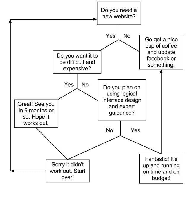
So – if you are a business or non-profit organization seeking to preserve capital while undertaking a new website design, I’d ask you to consider carefully the primary and secondary goals of your website. My guess is that you either want to sell a particular product, connect customers with events or classes, or communicate a particular idea. Think this through carefully, write it down, and consider the simplest path to achieving that goal. Then give us a call. We’d be happy to help make it happen, make it look good in the process, and achieve the results you seek together.


