We’ve been working on the Berkshire Mountain Distillers brand since 2007. Part of our process on any branding project is the act of distillation and market research… In the case of working on this brand, neither task was particularly onerous! The first thing we did in this case was a visit to the local liquour store here in Lenox – Nejaime’s (the go-to place for preparing that perfect Tanglewood picnic, BTW).
It’s interesting to see the choices that other designers and manufacturers have come up with over the years. There’s definitely a tension between tradition and innovation in the distilling world – with tradition winning out more often than not with the Scotch world and innovation coming to the fore in the vodka and clear-spririts. What would a totally modern Scotch look like? I’m sure there is one out there but we didn’t trip across it. I wonder if that tradition also reflects the age and inclination of the drinkers themselves.
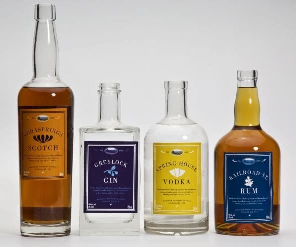
Chris Weld from BMD initially wanted to have different bottles for the different spirits, but in the end it proved not cost-effective for him. Nevertheless, as part of the process we looked at the implications of different shapes and designs on the overall brand impression.
The rectangular gin bottle was particularly nice, with a significant heft to it. Looking back at this image I’m prompted to switch the vodka and scotch bottles – the vodka is looking a little too hefty for what is generally considered a “lighter” spirit in terms of how it is used. Of course you can’t have a Scotch if you aren’t distilling in Scotland – I think this was us playing with the use of alliteration in the titles.
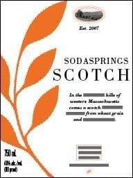
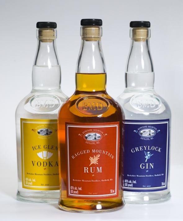
This was an early draft direction for the labels – a contemporary direction. In the end, the values that Chris wanted to convey included language like “traditional”, “hand-crafted”, “Berkshire”, “Carefully”. We moved away from the contemporary to a design that was both more traditional (a nod to that dynamic tension) and also graphically more flexible (pleasing the Bureau of Alcohol, Tobacco, and Firearms is a key part of the design task). We decided to focus on using color to distinguish the different spirits, and their variations.
Now, a few years into it, the brand is making its mark on the region and expanding across the country. Sales continue to grow as Chris pounds the pavement and continually refines and innovates with his product, including a line of limited-edition “ethereal” gins, Pear Eau de Vie, and other new products. The label system has proven very robust and workable and our turnaround for approval with the Feds has been excellent. We anticipate in the coming year that the brand will continue to expand, and we look forward to developing the message to put increasing emphasis on the locally-grown aspect of the product, and the ways that it fits in the overall picture of the Berkshires as a place where creative thinking, innovation, and pleasurable afternoons with a gin and tonic on the lawn at Tanglewood all come together.


